Sunday, December 25, 2011
2011, year in review
Here's a collection of photos from the year.. there were so many more I wish I could have included, and then there were things that we just didn't have photos of... but these are all part and parcel of what 2011 brought to us... The year included:
recovery from a serious auto accident
Steve finally getting a job in NM, and moving here, after being apart for over 7 months
a new puppy, Marley, to keep our other pup, Gibbs, company
even better, a beautiful new grandson, David
another grandson on the way (no photos yet!)
lots of exploration in the beautiful mountains of New Mexico
the Hardrock 100 mile run in Colorado
visits from family and friends (some pictured, some not)
the awful, devastating Las Conchas fire
a trip to the Grand Canyon - something we hope to do again
and lastly, a simple Christmas eve run on snowy roads here in the mountains, and a lovely evening at home with Steve and our friend, KZ..
Merry Christmas to all of you - you are the blessings of our lives, what makes us who we are.
May God bless you, as you remember the real reason for the season.
"Iin the beginning was the Word, and the Word was with God, and the Word was God. And the Word became flesh and dwelt among us, and we beheld His Glory... the glory of the only begotten of the Father, full of grace and truth".
John 1: 1, 14
Friday, December 23, 2011
FAV 15% for November FASO contest

Still Life with Penny 12x16 oil/linen
this one got the nod again for the November Bold Brush painting competition by Fine Art Studio Online.
I'm pleased, but surprised because this is such a lousy photo. The painting was purchased by a friend, and I'm glad it found a good home.
Tuesday, December 20, 2011
When Paintings Go Bad.....
Troubleshooting Your Painting
Before you throw it away, go through this list..

These paintings are from an exhibit in the Austrian Museum of Art.
The exhibit was called "Bad Painting, Good Art"
really, no kidding.
The major elements of your painting are: concept, composition, drawing, values, light, shadow, color, and edges. So, it makes sense that if something just isn’t working, it’s probably going to be one of these elements that needs to be corrected. Here are some questions to ask yourself if you find that a painting seems blah, or uninteresting, or just doesn’t seem to have that “flow” that you are aiming at. Or maybe just plain wrong somehow… (it happens).
Concept:
Did you start with a clear idea of what you wanted to communicate, or were you just painting things?
If you didn’t have a clear idea, can you frame one now? Can you select a focal point, and then decide which parts of your painting will help communicate that and which might be unnecessary?
Helpful hint: If you are feeling the need to fill every inch of canvas with something, then it is likely that your center of interest isn’t interesting enough, and you should work at emphasizing it more. Do this before you try to add more “stuff” in there!
Composition:
Is your center of interest placed so that the viewer takes a journey into your painting? If your center of interest is on the left hand side, did you create a visual path to keep the viewer engaged while reaching the focal point?
Is your center of interest smack dab in the middle? That’s usually not a good placement. Can you move it?
Helpful hint: Did you remember the “tic tac toe” rule of thumb in arranging your still life?
Helpful hint #2: Sometimes, cropping a painting down will condense the composition and make it stronger. You can do this in photoshop or equivalent, or use some cardboard or paper to frame in your painting in different ways to see if cropping might help. I frequently use what I call the "band saw editing" process. (ie, cutting down a larger painting into a smaller one)
Drawing:
Have you used perspective correctly? Are you sure?
Are objects that should be symmetrical, actually symmetrical? (vases with handles, or other complex shapes are especially bad about getting out of whack!)
Helpful hint: View your painting backwards in a mirror. This gives you a more objective view of what you’ve painted, without your own preconceived notions. Many flaws are revealed this way, unfortunately! But it’s a great way to find the flaws so you can correct them!
Values:
Does your painting have a good range of values?
Where is the darkest dark and the lightest light? Do these areas coincide with your center of interest?
Are there too many little value changes? Lots of choppy little areas? Can you simplify the values (NOT the colors) to only have 4 or 5 major values?
Helpful hint: try using color temperature INSTEAD of value changes to show form and light/shadow changes.
Light:
Did you select a single light source? If not, can you eliminate all but one light source? (this is especially noticeable in painting highly reflective objects like metal or glass)
Is your subject effectively lit?
Is there a flow of light across your painting? If not, how can you create that?
Have you given visual clues that there is intense light? (halation, letting colors flow into the atmosphere around them, reflected lights?)
Is all of your light the same color? Do you have areas that look like there is warmish golden light on them, and some things that look like there is bluish cool light? Light needs to be consistent in color.
Helpful hint: If everything looks the same as far as light goes, try putting some things into shadow, or lessening the value changes on some of the less important elements, so that your center of interest can really be the star.
Shadows:
Do your shadows have too sharp edges? Remember that cast shadows are most sharp where they touch the object, and become more diffuse and softer the further away from the object they go.
Are your shadows warm enough? Remember the rule, cool light/warm shadows.
Warm light/ cool shadows. Unless you are painting morning or afternoon light coming through a window, your light on a still life is probably cool. That means your shadows should be painted warm. Shadows even on a white cloth should not be blue, but a warm orangey green.
Form shadows might be a cooler, darker version of the object, but cast shadows will always be warm.
Do your shadows reflect the shape of the object? Form shadows should follow the contours of the object.
Hint: If your shadows look flat, or solid, they are probably not warm. Try adding a whisper of cad yellow, red, or orange to your shadow mixture.
Helpful hint #2. If you can’t decide what color your light is, put a piece of white paper under the light. Place something on it that will cast a shadow. Look at that shadow, and observe the color. Warm or cool? The answer will tell you what color your light is.
Color:
Color is tough! There’s a couple of important things to note about color:
- Color should serve the greater purpose of the painting – which, if realness is what we’re after, is to condense and find the truth and the essence of something. Color shouldn’t be used just because it’s “pretty”, but because it enhances that reality. Intelligently choose your colors!
- Lots of bright, out-of-the-tube color, all juxtaposed next to each other, usually does not serve to create an effective sense of light. Decide which is more important to you: bright color, or a light effect, and then plan your color.
- There should be a certain color strategy for your painting, and usually, the focus of attention should have the richest, warmest color. Some color strategies are opposites (for example, a red focal point against a green background, or variations of purple and yellow) or use of rich color against NO color.(for example, an orange against a neutral gray background)
Ask yourself these questions if your color seems dull, or muddy, or icky.
- Do you have a color strategy?
- Have you mixed your colors too much? Try to avoid mixing more than 3 colors at a time in any one mixture.
- Would adding small areas of pure color enhance your objective? Especially on your center of interest?
- Do your white objects have enough color in them? White is never really “white” except in the very lightest highlight. Mix a “dark white” for the local color of a white cloth, for example, and leave room for both highlights and shadow color.
- Are your transitions too blended? Color needs “boundaries” to exist as color. In other words, we recognize color by comparing it to what is next to it. If everything fades into a blur, colors get lost too. Think about using transition colors to show form instead of blending everything together.. Maybe try mixing a light, dark, and middle value for the objects you are painting.
Helpful hint: Select an area of your painting to receive the richest color (usually your center of interest) and use it fearlessly there!
Edges:
The more I paint, the more I am convinced of the importance of edges.
Are your edges dynamic? (do they vary between hard and soft?) If they are all the same, can you sharpen some edges, and soften others?
Can you look for a place to “lose” an edge? This would be where two values or colors are quite similar.
Are your inside edges (where light meets shadow) soft enough?
Can you create a sense of depth and space by using softer edges in background objects?
Have you inadvertently painted an “outline” around anything?
Does your background seem to purposefully turn around your objects? (this is bad)
Helpful hint: Look at your center of interest, and check to see if it has a variety of edges.
If none of these things seem to point you towards a solution, then you have my permission to scrape it all down, or throw it away. It is, after all, only a painting. Learn from it, and go on. But first, go have a cookie. Cookies cure lots of things.
Wednesday, December 7, 2011
Making a Copy of a Remington painting

after Frederick Remington's "The Cowboy"
11x14 oil/panel
Sometimes studying the art of a painter that you admire can be extremely beneficial. One of my favorite artists is Frederick Remington. His paintings inspired me when I was a young girl and probably played a big part in my wanting to be a painter. So today's project was to copy one of Remington's paintings. I took a few photos as I worked and will show the progression. Total work time was about 5 hours.

The Set Up
Here's the reference photo and the drawing, which I transferred to the panel using vine charcoal and a small fixative to keep it in place.

A close up of the drawing. I cropped the original painting, which was a taller vertical format, to fit a panel which I had handy.

Here I am simply filling in an average color and value for the major shapes. Not worried about detail, just covering the canvas and getting rid of the white. This is pretty much how I would proceed on any painting, except I don't usually do a detailed drawing.

Now I'm finished putting down all the color - I left some of the mane and tail of the horse because those brushstrokes would need to be a one shot deal.

I've started on the cowboy, the center of interest. Getting the main object down in a painting can help you to know how to finish the rest of it.

Changes now will be smaller. Work from the large light and shadow shapes and start breaking those big shapes into smaller shapes of light and dark, color and temperature. This was both easier and harder in trying to mimic Remington's work. Easier because I just had to see what he had already done and try to follow it. Harder, because I had to see what he had done and try to follow it! Though Remington's style of painting is not too far removed from how I typically work, he was working on a canvas, and i was working on a panel, which made getting some of the texture a bit difficult.

Still just moving around the figure to bring it to completion.

The face was really small, and I found it difficult to get the kind of detail that was needed. I don't have brushes small enough! I settle for an "approximation".

It's getting there. Remington used some really dark shadow colors. I think he probably used black, which I don't usually have on my palette. The small card I used mostly for reference did not give me all the information I really needed - I had a larger image in a book, but the colors were quite different and I never was sure which one was closest to the truth.

Just a little work on the horse's head ...

the cowboy is just about done, and now I'm bringing the horse to a finish.
and here's the final! This last image is color corrected - the in-progress shots were shot in natural light while on the easel and tend to be a little cooler than actual.
So what did I learn? Well for starters, to really try to do an actual "copy" is a very big project. This is more of an approximation - the image looks very close, but the brushwork is quite different than Remington's sketchy, textured work. And, just the intense studying I had to do in trying to paint this was educational in how Remington used color, edges, and temperature. And to think he painted from life, not photos! Amazing.
Remington documented the West like almost nobody else, telling the stories of the frontiersmen, native americans, and the military, so that we today have a record of those days.
I put these images together in a short video, so you can see it morph from beginning to end...
Tuesday, December 6, 2011
Team Ropers

Team Ropers 8x14 oil/panel
I started this one several weeks ago, using some great rodeo photos supplied by fellow artist friend Max. I just finally got it back out and finished it today. This action took place at a small rodeo in AZ. In team roping, one guy will try to rope the steer around his horns, and the other roper will go for his back legs. He's called the heeler. In this pair, the guy on the white horse is actually the heeler, though in this painting, as they have just started the chase after the steer, you can't really tell. Sadly, after it was all said and done, the heeler missed and they didn't score...
I am playing around a little more with the palette knife and used that for the background, and all those spectators. Sometimes less is more (most of the time, actually) and just indicting the presence of the folks on the bleachers and by the arena railing seemed better to me than getting bogged down in tiny little figures detailed. Besides, all the action and interest is up front and center! Which is a good thing to remember - the focus of a painting, whatever that might be, should be the area with the most defined edges, color saturation, and contrast. Everything else should be sort of like looking out of your peripheral vision.
Well, it is going to be below zero again tonight, so gotta go stoke that woodstove again! Brrrrrr!!!
Sunday, November 27, 2011
Holiday Show and Sale

The gallery in Jemez Springs, NM, where I exhibit, is hosting a holiday show entitled, (as you can see) The Gift of Art. Member artists will be presenting works of art, all under $250. I have a number of small works in the show, all priced VERY reasonably, way below normal retail, just for this show. Some unframed works are also there at very reduced pricing. If you're in the area, please stop by !
We're having a holiday reception Sat., December 10 at the gallery, complete with Christmas lights, a bonfire, and goodies - it'll be fun - come get toasty by the fire and enjoy some good food and drink and art!
ps. I'm pleased to report that two of the paintings I dropped off at the gallery today have been purchased! The greatest compliment that anyone can pay is to buy a painting.
Sunday, November 13, 2011
Another Portrait, color this time!

Gary 9x12 oil/panel
I frequent an artist website called Wetcanvas.com. Check it out if you've not been there - great resource, forums for every conceivable art topic or media, friendly and encouraging folks. In the portraiture forum, each year around this time they do a portrait swap. Folks get randomly paired up,and the partners paint portraits of each other (from photos, of course).
So, this is my portrait swap partner, Gary, a very fine pastel artist. I can't wait to see his rendition of me. I told him to make me look younger. :-) I find working from photos really, really hard, if you are trying to get accurate skin tones, and a likeness too. I hope Gary likes his painting...
Saturday, November 12, 2011
Using the Wipe-Away Method of Painting for Monochrome Studies

Wisdom, 8x10 oil\panel
Today's post will give some in-progress shots and descriptions of using the "wipe away" method of painting.
this has to be done quickly, all in one sitting, and working wet into wet. The premise is that you are wiping out the light areas, and refining with the darks. So, here goes....

My first photo didn't come out, but it was just showing an intial thin wash of color on the whole panel.. about value 3 or 4.
This shot shows just some basic placement of the face and main features... the "drawing" part if you will.
This shot shows just some basic placement of the face and main features... the "drawing" part if you will.

Okay now I am a little more purposeful about getting the main areas of light and shadow in their proper place, or as close as I can get. Because you are wiping away paint to get your lights, it's most important at this stage to decide where those lightest lights are, and get them down, so paint doesn't dry to the point where you CANT wipe them out. If you err, err on the side of too big a light area.. you can always go back with darks to correct.

Here I realized that there were shapes of light and shadow on his shirt under the strings of beads, and so decided to get those down, and then come back and wipe out the beads again on top of them. Important to note at this stage is that you as an artist have to decide what is important - the focus is obviously his face... but there's a heck of alot of things going on in his dress... some things can be left more suggested, softer edges, less detail. I decide his shirt and the beads can be only suggested so keep this area unrefined. We're about 20-25 min. into the painting at this point.

Now as you can see, it's just a matter of further refinement, once the basic shapes are in. In this method, halftones are the hardest to get without messing up edges. You have to work wet into wet. There is virtually no drybrush at all - sometimes it's a matter of actually pushing paint in the dark areas to get slight variations in value. sometimes, you might have a brush over an entire dark area more than once, to get the paint the right consistency to move like you want. Important also is to pay attention to edges... rather than drawing with your brush, it's more like pushing upward with the bristles to get those softer transistions, or coming back with a competely dry clean brush to wipe over a transition area to soften it. About 45 min. work time now.
Here is the finish. About an hour, maybe a little more. I would say the most important thing in doing this method is to focus on simply shapes of light and shapes of dark. Half of the stuff on his "outfit" I had no idea what I was painting, but I just tried to correctly put down shapes of light, shapes of shadow, and it generally works outs okay. Don't think of "drawing" - or painting a "thing" - an eye, nose, or whatever.. just see value shapes and try to get them right. Those of you who mainly draw would probably find this easier than those who don't.

Detail. In those dark areas, very slight wiping away gives those minor variations in value... adding back in darks to get the details, but keep the paint thin at all times... Edges are important... Also, brushing in the direction of the form helps. For example on his upper lip.. instead of brushing across the canvas, I made vertical brushstrokes following the shape of the lip.
Okay, tips, warnings, suggestions, etc.
1. You MUST have a non-absorbent surface. This was a wood panel primed with oil primer. A double or triple OIL PRIMED linen will work. Ampersand Gessobord is almost as good. Anything primed with acrylic primer will not work.
2. Avoid the dreaded DRIP!!! If you clean your brush with thinner to wipe away an area, make sure it is mostly dry (handle too) before you go to wipe off an area.... if there's thinner running down the handle, it will cause a big drip and can totally ruin the work you just did. I had this happen on the headband part of his headdresss... was wiping away the whites of the feathers. and a big drip started running down his face... I caught it with a paper towel and had to re-paint, but damages were minimal. I would've gotten a picture of it, but was afraid to leave it long enough to get a photo!
3. Since half tones are the hardest to achieve, select a subject that has really strong lights and darks. To Practice, maybe even start with just a single simple object, like an apple, or a vase or something... just to understand the technique.
4. It helps to have a brush with a sharp edge for wiping out thin areas. I use only flats when I paint, but brights, and maybe even filberts would work. I don't know if small rounds would have enough ooomph to scrub off paint. Use the largest brush you can. This was done with a #6 and #4 flat.
5. This method works great as a quick "underpainting" for complicated works. I often use a less finished version of this to get the structure of still lifes - a thin wash, some quick placement of objects, and then wipe away the lightest lights, and state the shadow areas.
Hope this was enjoyable. Sorry for the glare on some of the WIP photos, but working quickly, I didn't want to have to pick up the panel , take it in the other room, find a spot to photograph, take the picture, walk back to the studio. etc. etc. This really does have to be done all at once. I figure you would have maximum two hours, and that might be stretching it.
Thursday, November 10, 2011
Early Visitors, Shiprock

On one of the artist's forums that I frequent, each month one of us hosts a "challenge", and provides photos for us to use as reference for a painting. Though I'm not keen on working from photos, sometimes it's fun to see what you can do with them. I've been to this area, and that helps to get more authentic (I hope!) feel to it.
Shiprock is a sacred place to the Navajo... I can just imagine their first view of this magnificent formation. It figures prominantly in their mythology and culture. Here's an article from Wikipedia:
Shiprock (Navajo: Tsé Bitʼaʼí, "rock with wings" or "winged rock"[5]) is a rock formation rising nearly 1,583 feet (482.5 m) above the high-desert plain on the Navajo Nation in San Juan County, New Mexico, USA. It has a peak elevation of 7,177 feet (2,187.5 m) above the sea level. It lies about 12 by 20 miles (19 by 32 km) southwest of the town of Shiprock, which is named for the peak. Governed by the Navajo Nation, the formation is in the Four Corners region and plays a significant role in Navajo religion, mythology and tradition. It is located in the center of the Ancient Pueblo People or Ancestral Puebloan civilization, a prehistoric Native American culture of the Southwest United States often referred to as the Anasazi. Shiprock is a point of interest for rock climbers and photographers and has been featured in several film productions and novels. It is the most prominent landmark in northwestern New Mexico.[citation needed]
The Navajo name Tsé Bitʼaʼí, "rock with wings" or "winged rock", for the peak refers to the legend of the great bird that brought them from the north to their present lands.[6][7] The name "Shiprock" or Shiprock Peak or Ship Rock derives from the peak's resemblance to an enormous 19th-century clipper ship. However Anglos first called the peak "The Needle," a name given to the topmost pinnacle by Captain J.F. McComb in 1860.[7] United States Geological Survey maps indicate that the name "Ship Rock" dates from the 1870s.[6][7][edit]
[edit]Religious and cultural significance
The peak and surrounding land are of great religious and historical significance to the Navajo people. It is mentioned in many Navajo myths and legends. Foremost is the peak's role as the agent that brought the Navajo to the southwest. According to one legend, after being transported from another place, the Navajos lived on the monolith, "coming down only to plant their fields and get water."[7] One day, the peak was struck by lightning, obliterating the trail and leaving only a sheer cliff, and stranding the women and children on top to starve. The presence of people on the peak is forbidden "for fear they might stir up the chį́įdii (ghosts), or rob their corpses."[7]
So, my first thought when I saw the photo was, "I wonder what the natives thought when they encountered this formation for the first time." It must've been awe inspiring to them. So, pulling out my artistic license, I painted in some of these early visitors.
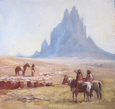
So, my first thought when I saw the photo was, "I wonder what the natives thought when they encountered this formation for the first time." It must've been awe inspiring to them. So, pulling out my artistic license, I painted in some of these early visitors.

Early Visitors, Shiprock 7x7 oil/panel
Working in a square format requires good planning for composition. I needed to balance the various elements.. figures, mountain, and land masses. The visual weight of the two riders, is balanced by the other figure and horse, and the darker eroded gully. These both are balanced by the presence of the rock itself. I think its working.
Friday, November 4, 2011
... and a Penny

...and Penny, 12x16 oil/linen

detail
Latest work to come off the easel. The gallery here is looking for still life works, so I tried to incorporate some elements that translate a tiny bit more southwestern. I have been working hard on brush work. Though my lousy photo doesn't show it, there is actually alot of abstract marks here and there. especially in all that "debris." Viewed close up as in the detail, they don't look like much, but seen at a distance, hopefully translate to a realism.
That penny just showed up on the still life table after I had worked on this for one session. I don't know where it came from, but it seemed to just fit, so I added it in. The garlic was raised on a friend's organic farm, and that pot was a housewarming gift to us when we moved here.
I find I enjoy painting alot of scattered odds and ends on the table, much more than say, flowers in a vase.. Give me debris anytime!
Thursday, November 3, 2011
Holiday Treasures Reception and Sale starts Friday, Nov. 4
I have a group show, Holiday Treasures, with John Traynor and two other artists, which opens Friday, Nov. 4 in Keene, at Monadnock Fine Art Gallery. Here's a few photos of some of the paintings installed for the show.


This one sold while they were hanging the show.

There are a few more paintings; I wish I could attend the opennig, which is tomorrow night, Nov. 4, from 5-7pm. The show will be open through the holidays.
Random Thoughts,Tips, Tricks, and Principles about Painting... and a Puppy

My dog Tucker when he was a puppy
because we all need to see puppies now and then.
Here's just some things about painting that I've been thinking about and concentrating on, a few tips and tricks, and a some general principles. You won't find new ideas here - nothing I could say hasn't been said before, but maybe something will strike you in a new way and you can take home some ideas from it... These old tried and true principles have served artists for centuries and they really are just that: TRIED and TRUE.
Here goes:
1. Everything is either in the light or in the shadow. One of my favorite quotes from Stapleton Kearns

Initial block in stage of plein air work
This is so basic, and yet I see artists fail to consider this nearly every day. There is light, and there is shadow, and they will not be painted the same way. In the illustration above, I've blocked in the basic light and shadow shapes of the cliffs -its pretty much the first thing I do in any painting - find the light and shadow patterns, and get that down.
Next, along with that:
2. Keep the light and shadow values separate. Think of light and shadow as two families .... say.. the Hatfields and McCoys. You have to keep them separate or all chaos ensues. How do you do that? Remember that nothing in the light family will be as dark as anything in the shadow family.... and vice versa... no matter what color it is! Look at the illustration below.

Notice the shadow on the zebra's neck cast from his ear. Can you see that the value of the white stripes in shadow is darker than the black stripes in the sunlight? So, no matter WHAT color something is, even black or white... the values of light and shadow must be kept separate.
(I'm not talking highlights or accents here, but general values - there IS a place for small touches of light highlights or dark accents) In general, once you decide if something belongs in the light family, or the shadow family, then keep the values consistent with whatever family they belong to. You know where I see this mostly ignored? In painting foliage on trees. Beginners will want to spot highlights all over the trees and it ends up looking like polka dots. Sure, put some areas of light and dark, but keep the value, as a shape, in one or the other family. Look at the juniper bushes in the top photo here... there is a shadow part of the bush, and a light part. In the finished work, nothing in that shadow part will be as light as anything in the light part, and vice versa. The shape of light, and the shape of shadow, need to remain separate.
Sheesh, did I repeat that enough?
3. Value does the work, but color gets the credit. I wish I could remember who said this - it is a great quote. What it means is that, more than anything else, you MUST GET THE VALUES RIGHT FOR A PAINTING TO READ CORRECTLY. If the values are right, then you can be whimsical or imaginative, or just a little "off" with color, and it'll still be okay. The values, the shape of light and dark - this is the skeleton, the framework, on which you hang color. If you get the framework right, you can hang almost any color on it.

Purple horses?
This painting was for a particular mural mosaic project I was part of a few years ago. The colors had to fit in a larger image, and so I had to work with this purple color. But since the values here are good, we look past the fact that the cliffs, ground, and even the horses, all are purple and violet. It still works. Values, people, get the values down!!!
4. Edges are more important than you could ever imagine. This is probably the area where I am concentrating the most lately. A variety of edges - soft edges, hard edges, lost edges... this is the "soul" of a painting - this is what makes the difference between poetry and a news report. I could write pages on it even now, but think about this at least. Look out at something in your room. Focus on it. Now, hold your hand out in front of you, and look at that. You can't focus on both at the same time...One of them is going to be in your peripheral vision, and if it is, it's going to be less defined, more "fuzzy". This principle in painting can be applied thusly: Sharper edges, crisp, hard, edges, should be placed where you want the viewer to look.
Softer, fuzzier, less defined edges, should be everywhere else. There's about 10,000 more things to say about edges, but that'll be enough for now.
5. Be intentional. Most of us paint using the brush, rather than using the paint ON the brush. We scrub it on, or "lick" the canvas.. repeatedly brushing the same spot over and over, almost like being in a trance. Try this: Look at your painting.

Decide what color, value, and temperature you need for ONE SPOT. Mix that color. Put some on your brush, and put it on your canvas. NOW STOP!!! Look at the next spot. Shampoo, rinse, repeat. This ol' John Deere tractor was painted this way. Nowhere on the tractor did I blend anything. Every spot of paint you see was put down in one stroke. This is just a small exercise painting, but you see what I mean. By being intentional in the first place about what color and value is needed in a certain spot, we can just put that down, and move on to the next thing. Maybe even, gasp, consider, spending as much time LOOKING and THINKING about what the next stroke should be, before you make that stroke!
6. Work from thin to thick, and vary the paint application. I'm really focusing on this too. This, I think, brings about the excitement in a painting that makes it a work of art. Thick, luscious strokes, and transparent thin washes. both are necessary to bring that spark, that life, into it. I think a good rule of thumb is to keep the paint thin, especially in shadow areas, until you have it established, and then go for big juicy strokes. If you get those wrong, scrape it off rather than trying to paint into it.. Along with this idea comes also the principle of holding your brush - if you hold it like a pencil, you will be more likely to dig into the fat paint and remove it rather than lay on top of it. Holding your brush like a knife will help you to lay new paint gently on top of the previous layer without digging into it. Try it.

the background of this painting was done as a very thin, transparent wash. I then scraped it down even further to imitate the texture of an old painted silk screen. Thicker paint is applied on the ginger jar, and in the light areas of the cloth.
Well, I guess that's plenty to ponder for today. I gotta go paint!
Tuesday, November 1, 2011
New Gallery, New Work

Jemez Fine Art Gallery
I'm pleased to announce I've been invited to join Jemez Fine Art Gallery , located in our little village of Jemez Springs. Even better, they are asking for Southwestern cowboy and horse images. I am almost giddy, because I LOVE painting that kind of thing, but, as you can imagine, there's just not much call for it in New England. So, now I have a good excuse to paint cowboys! Yippee!!!
I won't actually take work over to the gallery for another week or so while I finish up some things, and I'm not listed on their webpage yet as a member artist. I think it'll be a good fit, and I'll be working with some fine artists and nice folks.
Here's a couple of small "southwestern cowboy and horse images" that I've completed recently.

Adjusting Stirrups 5x7, Sold

Checkin' on the Herd, 9x12

Above Jemez Springs, 5x7
Saturday, October 29, 2011
back in the game!!!

Rooster sketch, after R. Schmid painting
About 15 min. pencil on paper
About 15 min. pencil on paper
Just wanted to let ya'll know the leak is fixed (or at least, the roofers have been here and charged us big bucks to do the work!). We have a new keyboard, and I can finally use this computer again. Don't have any paintings to share yet, but am working on a few.
Meanwhile, here's a quick sketch done in the car on the way to the Grand Canyon last weekend. It is very hard to draw something you see out the window - objects tend to go by really fast, ever notice that? So I was browsing through my copy of Alla Prima by Richard Schmid, and sketched these roosters from his fabulous painting of poultry. That panting is pure poultry .... er, uh, POETRY ...
More stuff to come soon!!!
Thursday, October 27, 2011
A small mishap
Our roof sprung a leak in yesterday's rain - right above the computer desk.
The keyboard and mouse got soaked and are not working.
Since that's the only computer with camera software and Photoshop I am unable to post paintings till we get it up and running again. Stay tuned!
The keyboard and mouse got soaked and are not working.
Since that's the only computer with camera software and Photoshop I am unable to post paintings till we get it up and running again. Stay tuned!
Tuesday, October 25, 2011
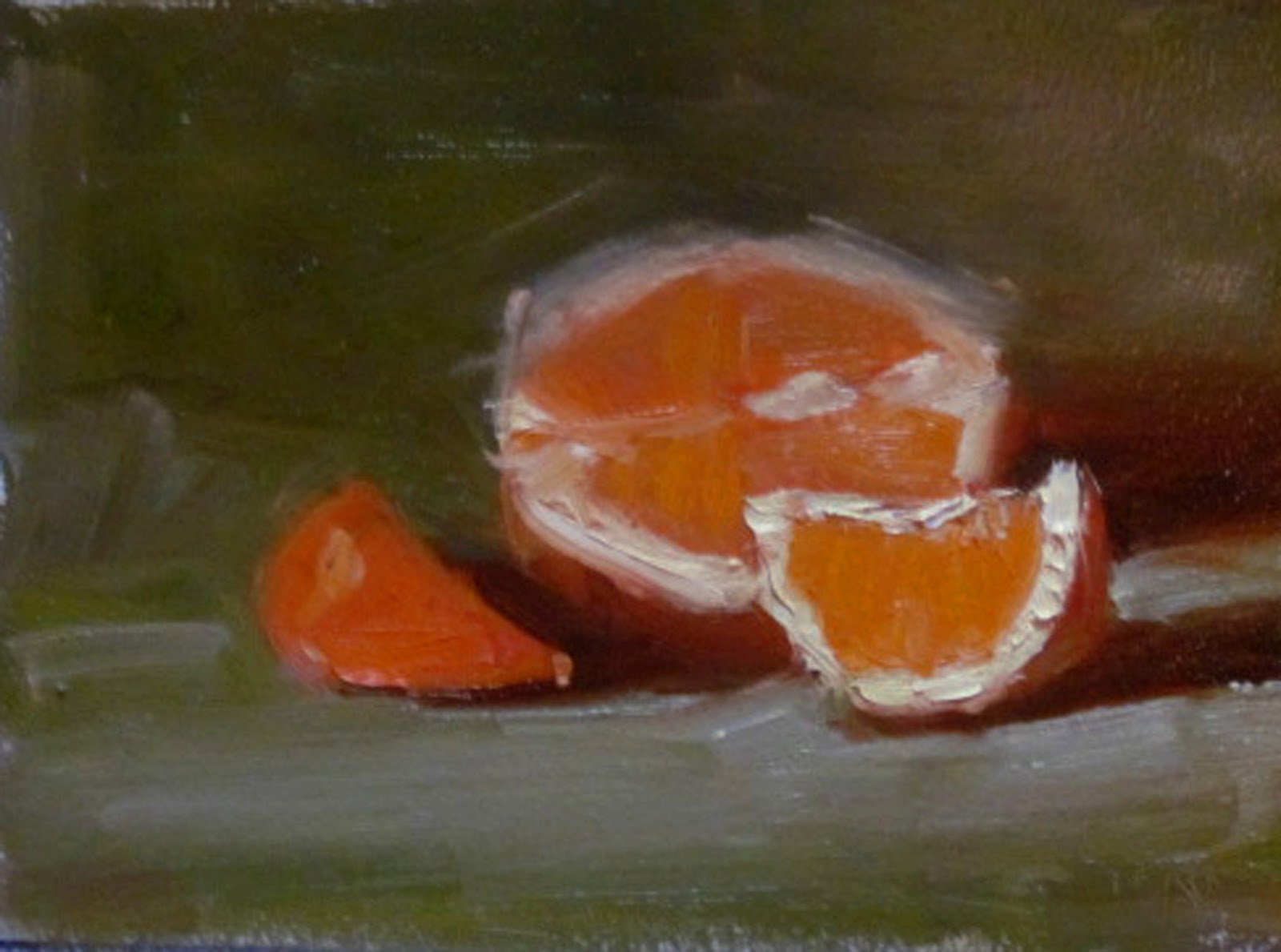
Orange and Brandy Bottle

Orange and Brandy Bottle
This is the latest larger piece I've been working on. I had been wanting to do a "focused light" sort of set up, and the peeled orange with the copper pot reflecting it back allowed me to really put all the light in that one area. The brandy bottle had such a pretty label and shape, it seemed like a good addition also. I've been unable to get really good photos lately. For one thing, my "good" camera broke, and I only have a small digital. Secondly, I like to photograph in natural light, because I paint in natural light. Our downstairs has huge windows (passive solar) and there is so much light bouncing around that it's impossible to avoid glare, or it sure seems that way.
Though it doesn't show much in this poor photograph, I've been trying to change up the brushstrokes, loosen up, and use variation of paint application. There's both transparent paint and impasto. Plus some knife work here and there.
The 120 painting project is ongoing.. I'm on #9 now, and enjoying the fun of cranking out a small study every day as a way to warm up and get my brain in gear. Plus it allows me to practice and experiment with some different ways of doing things. Some of these will be for sale and will be on my main website.
Here's the latest in the series.. and yes, that is probably the same orange as in the painting (the one that's not sliced, silly) Here's the link to the 120 paintings blog.
Wednesday, October 19, 2011
Placing Your Focal Point

When you are arranging your subject, whether it be a still life, portrait, or landscape, you will most likely have
a center of interest, or focal point. It's usually the thing that attracted you to the scene in the first place, if it's a landscape, or it's what you want to be the "big thing" in your still life painting. Usually in portraits or figures, it's the face (not always, but usually).
There's a little principle of composition called "The Rule of Thirds". It just means that if you divide your painting into thirds, horizontally and vertically, that at any point where those lines intersect is a good spot to place your focal point. You can easily remember it by thinking of a tic tac toe grid. Here, I've done one below.

That orange which is so obviously the attention-getter in this painting, is placed on that bottom right intersection.
It usually NOT good to put your center of interest smack dab in the middle, or way off to one edge, where it might lead viewer's eye out of the painting. It's most often best to place a center of interest in either the right top or bottom intersecting point.
Why? We "read" paintings like we read words... from left to right. Looking at a painting is like a little visual journey.... we tend to start at the left (unless there's a compelling reason to start somewhere else) and walk through the painting to reach the center of interest. If that center of interest comes right away, on the left side, then we don't have any good reason to keep going. Our visual journey is over, and we leave. Now, there are ways to direct eye movement back and around in a painting - I'll talk about that a little bit here.
Here's a couple of other examples:
Top Right:


Another top right on a vertical format:

Top Left (this requires directing the viewers eyes through the painting in a backwards "C" to get them to the focal point.


Here's a bottom left:

In this case, the path, leading to the very bright spot, is compelling enough to keep the viewer going, following that, back down the trees to the water puddles on the path and back to the hiker. At least that was the plan. But it's tricky putting a focal point on the bottom left like this. Here's another.

In this case, the focal point really could be either the pint of Guinness, or the group of figures by the bar. In either case, the eye certainly lands on the pint glass first, but the explores the painting - going to the group of figures, over to the gal in the reddish shirt, down to the foreground figure and back to the pint glass. So, I think this works, though it requires some thought and planning to put a center of interest so "soon" in a painting.
Well, hope this gives you some ideas when you go to plan your composition. This is a tried and true principle and it WILL help you. That doesn't mean you can't break the rule and still have a good painting, but you'll just have to work alot harder to make a pleasing arrangement that keeps the viewer entertained.
Happy painting!
Just another reminder of my new blog to document an experiment of doing 120 paintings (nearly daily).
Subscribe to:
Posts (Atom)


