The following is the outline for our last day of color class. We talked about, and practiced painting, what happens to color as it recedes into the distance.
Flashback! Remember that song by Procal Harem? A "whiter shade of pale" is a good catch phrase for today's lesson.
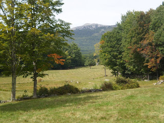
Just remember the principle of “more and less.”
Close objects in a landscape have
MORE intense, pure color.
MORE contrast in values (between light and shadow sides)
MORE defined edges
MORE detail
Distant objects in a landscape have:
LESS intense, pure color.
LESS contrast in values. (between light and shadow sides)
LESS defined edges
LESS detail.
Yellow is the first color to "drop off" as distance increases. That means that any object whose color is yellow, or contains yellow (greens, browns, oranges, warm reds, etc.) will lose more and more of that yellow hue as they get further away. You'll need to lighten and gray the yellow to portray this distance. Gray it by adding its compliment, purple. You might also want to consider using a cooler version of yellow in the mix. For example, a bright yellow clump of daffodils up close could be painted with almost pure cadmium yellow light. Far away, that daffodil color might be better represented by mixing some cad lemon ( a "cooler" yellow) with white and its compliment, purple. (or a mix of ultramarine and alizarin) Sometimes I've also used yellow ochre for a situation like this, as it is a cooler, duller, grayer version of yellow.
Red is the next color to drop out of the equation. So, reds tend to get cooler, and more pinkish purple as they get further away.
Blue is the last color to drop off. That is why we often see distant mountains as blue. all the red and yellow have diminished and we're left with those bluish notes.
As objects recede into distance, color will get lighter and grayer and COOLER in temperature. All the colors fade out and lighten to eventually reach a pale gray. (remember that song title?)
White is the only exception to this rule. White gets darker and grayer..

See illustration above to see how this works in practice. A red barn and tree are shown close up, mid-distance, and far away. The color swatches show the shadow and light colors of each group. The swatches are the shadow and light sides of barn color, tree color, grass color and barn door color.
Notice how the color, the temperature, and the values changes.
Close up: Colors are rich, warm, and intense. There’s a lot of difference in value between
the light and shadow sides. The inside of the barn door is a deep warm black. Details are evident.
Mid-distance: The colors have gotten slightly cooler, and grayer in tone.. There is not as much difference in value between light and shadow sides. Not as much detail is evident, and the black of the barn door opening is now a dark purplish brown.
Far away: The colors have really gotten lighter, and grayer. There is barely any difference in value between light and shadow sides – really only color temperature notes the difference. The deep shadow of that barn door is now a purplish blue.
That's it! Pretty basic stuff, but as many of us have been painting beautiful autumn foliage, it is good to remember that those vivid reds and golds of trees near us are just not going to be that same intensity further away. We can use the principles of aerial perspective to enhance the sense of space and distance in our paintings.


