Saturday, October 10, 2009

Form Shadows and Background Color


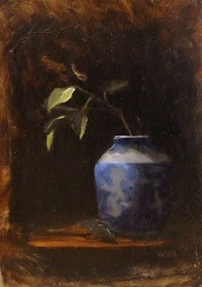
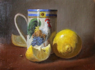
Here are two small still lifes. I'm using them as an example of a principle about light and shadow and background color.

In a still life, one of the important things to consider is the background. The background doesn't just represent the "back" of whatever space you are painting.
It is , or should be, representative of the air and the atmosphere surrounding the focal points. Your objects need to exist in space.

By the way, while I'm thinking of it, consider giving your still life objects MORE space than you might initially be inclined. One of the common traits of beginning artists is to paint that pot, or the apple, or whatever as large as they can fit on the canvas. Let them breathe! Give them some room! Up front and in your face can be a valid compositional decision, but if you will take time to study some of the great paintings, you will notice that there is some comfortable distance between the viewer and the objects portrayed. Try it!

Background color can be light or dark, it can be generally warm or cool. These two paintings are examples of a darker, warm background, and a lighter, cooler background. Background color is an aesthetic decision that you will make as you arrange the still life in the first place.
However, having decided on your set up and the background color, you have also determined, in part, the form shadow color of your objects.
How does that work?
Since the background is at least in part the "air" around your objects, as the form of those things recede into space they have a little bit more of that air or atmosphere between them and you, the viewer. When you are trying to "make that pot look round" what you are actually doing is trying to show how the form turns back and goes further into space. One way to help create this illusion is to include a little bit of the background color into those form edges. Take for example, the leaf that is in the first still life, that is on the right side of the stem. It is further back in space than the more brightly lit leaf, and you can see how it has much more of the background color floated into it. You can also see this in the shadow side of the pot... there is a bit of that background in there, and the effect is that the pot is round, and the edge turns back into space.
In the other still life, the background color is lighter and cooler, but the principle still works.
Look at the lemon slice in the background. Compare the color of that lemon to the foreground slice. Can you see that the further lemon slice contains some of that cooler greenish gray background color? If you have trouble seeing it, try squinting. Squinting is a great way to reduce superfluous detail while you are painting, and renders the major values more clearly.

There is an important principle to remember, and that is this:
COOL LIGHT/ WARM SHADOW.
The overall shadow color in a still life should always be warm!
Unless you're painting objects on a sunny windowsill, then you should consider that the light represents cooler, natural north light. This means shadows will be warm. So, if you have a cooler background color, as in the second example here, it is only a touch added to the native color of your object, or mixed into your overall shadow color. Don't make the mistake of thinking that you can just take your background color and use that as shadow color. This is where the intelligence and keen observation of the artist must come into play. Look at the whole lemon - can you see how the overall shadow color is very warm, an orangey-green, and the reflected light from the table top is even warmer, but right at the top edge of the shadow form, there is a bit more of that background greenish gray color. There's no reflected light there, and no direct light, so the background color has a bit more influence.
Well, this is alot to think about, and there are no quick fixes or "systems". There is only the intelligence and observation of you, the artist, making decisions which best further the concept and design of your painting. If it were easy, anybody could do it, right?

Friday, October 9, 2009

Donations for a Good Cause

I have always felt that being able to spend time doing what I love so much is a real blessing. I'm quite thankful to paint full time, with all the
joys (and sometimes frustration!) that brings me on a day to day basis.
So, I feel it's only right to give back a portion of my work, and I make it a point to donate art
for various charities, good causes, and Christian ministries. I make no apologies for being a person of faith!
This small still life (8x10) entitled "Stoneware and Peaches" is donated to the Jaffrey Civic Center. The Civic Center is really a gem; it hosts many art exhibits during the year, juried competitions, and art classes, besides offering meeting and classroom space for numerous other community events. So I'm happy to give this work to them for part of their annual fundraising appeal. The building was built around 1960, and is not handicapped accessible. We are currently raising much needed capitol to install an elevator, so that anyone and everyone can enjoy the exhibits and other functions at the Center. This painting is being raffled off later this month. Tickets are only $5, so if you'd like to purchase a chance for this painting, please contact me directly at deb@debpero.com or call the Jaffrey Civic Center at 603-532-6527. And here's the sales pitch: Don't delay, tickets are going fast! :-)

Thursday, October 8, 2009

Working Like Mad and Using Canvas Scraps


Oh boy, this time of year gets really busy! Besides working on our mural project here in town, which turned out to be just about a full time job the last 4 or 5 months, I've got several shows to prepare for. More about those later, but mostly lately I'm painting like mad. This little painting is one I finished this week, entitled "Carnation and Old English Creamer". (you can purchase this painting here. And on a composition note, I originally just had the carnation and the creamer. Knowing that having just two items in an arrangement, I would have to work to be sure one was the focus of attention. I thought that by softening the edges of the carnation, and making the creamer very sharply defined, that would do the trick. It did not, and this painting suffered from the "one for each eye" kind of syndrome.. Where do I look? At the carnation? At the creamer? I realized that a spot of rich color would tip the scales in the favor of the creamer, and added the single grape. That did the trick, don't you think?

Since everybody is budget conscious these days, I thought I'd share a tip for using up some smaller scraps of canvas. Since I sometimes pick up odd size frames at our local frame shop, I need to custom make a painting surface for them. There are two ways to do this. First is to create a panel by cutting a piece of masonite ( I buy a whole sheet, prime it, and then cut it to size.) You can see how to make your own panels here.

The other way to create a painting surface in an odd size is to use canvas scraps. If you buy rolls of canvas, then you'll have odd pieces left over here and there. Keep those to use for projects like this. I also buy pre-primed canvas pads. These come in various sizes up to about 18x24 and usually contain 10 sheets of canvas per pad. I like to get 16x20 size.. It is about $14, and I often use these sheets for odd size works. Just measure out what size I need, draw the outline on the canvas, and paint! Then, once the painting is dried, I will cut the painting out of the larger sheet and affix it to a backing board. This board can be anything from a piece of masonite to plywood, to gatorboard - anthing that can provide a non-warping sturdy surface to glue the canvas to.

Here's what the painting looks like before I cut it out of the pad. This one is a really odd size, 4x10, but I have a nice little frame for it. While painting, I just use the pad itself (has a heavy cardboard back) as a nice support. I use a 3M spray adhesive to affix the canvas. It sticks like, well, glue, but if I need to remove the canvas for any reason later down the road, I can carefully peel it off the backing with no damage!

Tuesday, October 6, 2009

Painting Workshop!


I will be leading an oil painting workshop entitled Color Camp! on Wed. mornings, beginning Oct. 14 at the Jaffrey Civic Center. The workshop will run for 3 successive weeks, 9am - noon. Each session is $35. You can call the Civic Center at 532-6527 to register for one or all three sessions.

This will be a fun, light-hearted workshop chock full of some good, useful info. Though primarily geared towards beginners, we already have a number of seasoned painters attending, and it will be a good review of some basic principles of color and how to make intelligent color choices in your painting. With the group attending, we should have some great discussions!
Here's a basic overview of the three sessions.

Color Camp

Not rules, but tools!

As artists, we want to use all the tools at our disposal to help us create good, solid paintings. These 3 sessions are designed to review some basic principles of color that can help us make intelligent choices as we work. Consider these some added “weapons” in your arsenal or tools in your toolbox that you can pull out when you need them!

We won't be trying to complete polished paintings, but rather we'll tackle some exercises to re-enforce each day's lesson. In addition, each day we'll look at a "problem painting" that contains a common error. Heck, it might have several problems! Based on our color lessons, the class will "dissect" the poor painting and decide what's wrong and how to fix it, and then you'll get a chance to create your own "new and improved" version!

Session 1: When You’re Hot, You’re Hot!

Color Temperature: It matters!

Why can’t I use the same colors to paint an orange that is sitting on my kitchen table as an orange sitting outside on my deck railing? In other words, how does outside light differ from inside light? One word: COLOR TEMPERATURE! (okay, okay, that's two words). Tip: This might be very useful info if you want to paint still life or landscape... or interiors.. or figures inside or outside... or old cars rusting under a tree... or maybe a package of neon gummi worms....

Where is this orange? Outside or inside?


Session 2. Good Morning, Sunshine!

Portraying Time of Day in Your Landscape

What’s the difference between morning light and late afternoon light? Is there a difference? How do we make our paintings look like morning, noon, or evening?

Look at this poor painting. I can't tell what time of day it's supposed to be. And there are some other real errors. Should we shoot it and put it out of its misery? Wait, there's hope! Come find out how we can correct and improve this baby.


Session 3. Way Over Yonder…..

The effects of Atmosphere on Color.

When is a red barn not red? What happens to autumn foliage on that distant hillside?

This painting has a problem. Actually, it has several glaring problems, and these problems are common errors that can be avoided by understanding some simple principles of color and design.

Do you know how to fix this painting?


Well, come join us for some fun as we focus on color! There are about 3 spots left in the class.