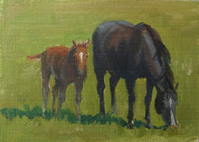
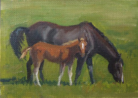
I just love painting horses. These two are tiny little art cards - 2.5 x3.5 inches.
I was thinking while painting today (note: this does not always occur) and decided I'd post a few random ideas about painting. So, in no particular order.....
1. Never let your background know what your foreground is doing. In other words, the background should always remain in the, uh, background... it's just back there, air, or distance.... dont make it a "thing" by painting around the edges of say, a bowl with your background color, leaving little ridges or, spaces of color. Better to paint INTO the edges of your object with background color and then go back and clean up the edges with the foreground color.
2. Have your big idea before you start to paint. No matter what the subject matter, you need to have decided before you begin what you want this painting to be ABOUT. Is it about one spot of rich color against a sea of grave color? Is it about one area of deep dark in an otherwise high key painting? If you don't know WHY you're painting , then you end up just painting objects. And how exciting is that? Once you know the big idea, then all the decisions you make as you go (emphasize this? diminish that? move that tree? leave out that telephone pole?) are to make your big idea happen, and not to just record an assortment of objects on canvas.
3. Value does the work, but color gets the credit. Value is the structure of the painting - the framework upon which you hang the lovely adornment of color. The lights and darks, and the interplay of them, is what holds the painting together. An exceptional painting has good value structure, even though it might be the color that attracts our attention. If you have to get one thing right, it should be the values. If you are unsure of your values, try taking a digital photo, and in whatever photo editing software you have, change it to black and white. If it reads right , the values are good.
4. Camera lens make good viewfinders. If you want to compose a painting out of what's in front of you, whether landscape or still life, and it seems too confusing out there... look through your camera - it crops out all the surrounding confusion, and lets you focus in to find a good composition. The exception to this is.....
5. Not all paintings should fit in a standard shape frame. (your camera lens is probably equivalent to a 3 x 4 ratio - like a 9x12, or 12x16.) You might need a totally custom size, like the 10.5 x 17.5 I just did, or the 18 x 29 I just had my husband cut for me.... So don't get bogged down by canvas or panel size. Paint the shape that best fits your composition. Painting on panels makes this easier, or paint on loose canvas, and cut it to the shape you want when done.
6. Edges... they're important. Maybe more important than most of us think. If you want your painting to look like a painting, something REAL, not "like a photo".. then pay attention to edges.
Distant objects?(a row of trees against the sky, the edge of a meadow in front of those trees....) soft edges. Focal point, That big ol' barn) center of attention? sharper edges. I could do several posts on just edges.
and, lastly, because I have to go figure out something to cook for supper....
7. Shadows should be thin and transparent. Does this seem obvious? Well, without going into a long paragraph about shadows, just remember this one thing... the shadow area of your painting should not have clumps or ridges of paint. NEVER impasto in a shadow. Impasto implies light and texture and surface. Shadows are just air where the sun don't shine. Keep the paint thin. "Transparent" doesn't mean use transparent paint. It means they should look transparent. This is achieved by first, using thin paint, and second, by wise choice of color. While this will vary with each painting, try this:
For warm shadows (as in a still life), try a whisper of cadmium color (red, orange, yellow) in your shadow color. Strange, I know, but it works! For cool, outdoor shadows, try using a cooler version of the local color plus it's compliment as a base shadow color. If you have sunny, green grass, the local color might be a warm yellow green. A shadow color might be a cool green (thalo or veridian) plus its compliment, red. Only use a COOL red, such as alizarin, not cadmium. This principle gives a good start for finding the right color, but use your artist's eye to select just the right shade...(no pun intended).
happy painting!