My dog Tucker when he was a puppy
because we all need to see puppies now and then.
Here's just some things about painting that I've been thinking about and concentrating on, a few tips and tricks, and a some general principles. You won't find new ideas here - nothing I could say hasn't been said before, but maybe something will strike you in a new way and you can take home some ideas from it... These old tried and true principles have served artists for centuries and they really are just that: TRIED and TRUE.
Here goes:
1.
Everything is either in the light or in the shadow. One of my favorite quotes from
Stapleton Kearns Initial block in stage of plein air work
This is so basic, and yet I see artists fail to consider this nearly every day. There is light, and there is shadow, and they will not be painted the same way. In the illustration above, I've blocked in the basic light and shadow shapes of the cliffs -its pretty much the first thing I do in any painting - find the light and shadow patterns, and get that down.
Next, along with that:
2. Keep the light and shadow values separate. Think of light and shadow as two families .... say.. the Hatfields and McCoys. You have to keep them separate or all chaos ensues. How do you do that? Remember that nothing in the light family will be as dark as anything in the shadow family.... and vice versa... no matter what color it is! Look at the illustration below.
Notice the shadow on the zebra's neck cast from his ear. Can you see that the value of the white stripes in shadow is darker than the black stripes in the sunlight? So, no matter WHAT color something is, even black or white... the values of light and shadow must be kept separate.
(I'm not talking highlights or accents here, but general values - there IS a place for small touches of light highlights or dark accents) In general, once you decide if something belongs in the light family, or the shadow family, then keep the values consistent with whatever family they belong to. You know where I see this mostly ignored? In painting foliage on trees. Beginners will want to spot highlights all over the trees and it ends up looking like polka dots. Sure, put some areas of light and dark, but keep the value, as a shape, in one or the other family. Look at the juniper bushes in the top photo here... there is a shadow part of the bush, and a light part. In the finished work, nothing in that shadow part will be as light as anything in the light part, and vice versa. The shape of light, and the shape of shadow, need to remain separate.
Sheesh, did I repeat that enough?
3. Value does the work, but color gets the credit. I wish I could remember who said this - it is a great quote. What it means is that, more than anything else, you MUST GET THE VALUES RIGHT FOR A PAINTING TO READ CORRECTLY. If the values are right, then you can be whimsical or imaginative, or just a little "off" with color, and it'll still be okay. The values, the shape of light and dark - this is the skeleton, the framework, on which you hang color. If you get the framework right, you can hang almost any color on it.
Purple horses?
This painting was for a particular mural mosaic project I was part of a few years ago. The colors had to fit in a larger image, and so I had to work with this purple color. But since the values here are good, we look past the fact that the cliffs, ground, and even the horses, all are purple and violet. It still works. Values, people, get the values down!!!
4. Edges are more important than you could ever imagine. This is probably the area where I am concentrating the most lately. A variety of edges - soft edges, hard edges, lost edges... this is the "soul" of a painting - this is what makes the difference between poetry and a news report. I could write pages on it even now, but think about this at least. Look out at something in your room. Focus on it. Now, hold your hand out in front of you, and look at that. You can't focus on both at the same time...One of them is going to be in your peripheral vision, and if it is, it's going to be less defined, more "fuzzy". This principle in painting can be applied thusly: Sharper edges, crisp, hard, edges, should be placed where you want the viewer to look.
Softer, fuzzier, less defined edges, should be everywhere else. There's about 10,000 more things to say about edges, but that'll be enough for now.
5. Be intentional. Most of us paint using the brush, rather than using the paint ON the brush. We scrub it on, or "lick" the canvas.. repeatedly brushing the same spot over and over, almost like being in a trance. Try this: Look at your painting.
Decide what color, value, and temperature you need for ONE SPOT. Mix that color. Put some on your brush, and put it on your canvas. NOW STOP!!! Look at the next spot. Shampoo, rinse, repeat. This ol' John Deere tractor was painted this way. Nowhere on the tractor did I blend anything. Every spot of paint you see was put down in one stroke. This is just a small exercise painting, but you see what I mean. By being intentional in the first place about what color and value is needed in a certain spot, we can just put that down, and move on to the next thing. Maybe even, gasp, consider, spending as much time LOOKING and THINKING about what the next stroke should be, before you make that stroke!
6. Work from thin to thick, and vary the paint application. I'm really focusing on this too. This, I think, brings about the excitement in a painting that makes it a work of art. Thick, luscious strokes, and transparent thin washes. both are necessary to bring that spark, that life, into it. I think a good rule of thumb is to keep the paint thin, especially in shadow areas, until you have it established, and then go for big juicy strokes. If you get those wrong, scrape it off rather than trying to paint into it.. Along with this idea comes also the principle of holding your brush - if you hold it like a pencil, you will be more likely to dig into the fat paint and remove it rather than lay on top of it. Holding your brush like a knife will help you to lay new paint gently on top of the previous layer without digging into it. Try it.

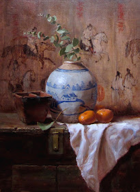
the background of this painting was done as a very thin, transparent wash. I then scraped it down even further to imitate the texture of an old painted silk screen. Thicker paint is applied on the ginger jar, and in the light areas of the cloth.
Well, I guess that's plenty to ponder for today. I gotta go paint!


